

Met Gala ‘24: Here’s why they will KEEP getting it wrong!
INTRODUCTION
The Met Ball was created in 1886 by a group of young Americans in Paris, who wanted to build a national institute where American people could gain access to art and art education. That seems like such a far cry from today’s interpretation of the Met, which is essentially a gaudy demonstration of wealth that upholds the social hierarchy of Western society. Only the who's who are able to attend the Met. It is interesting that an “altrustic” idea, with practicality in mind, was tainted to showcase classism at its finest. Now, I doubt that the group of young Americans were considering other bodies beyond white bodies to be exposed to the arts/art education. We must examine the centered perspective of what we are engaging in so that we do not overly extend ourselves to ideas that did not have our existence in mind. With that being said, I am a lover of art and fashion is an art form that I enjoy very much. However, I would prefer that the initial mission statement of the Met be integrated in the Ball moving forward.
ATTENDEES MUST PARTNER/ENDORSE A COMMUNITY-BASED/NON-PROFIT ORGANIZATION THAT SPECIALIZES IN ART/ART EDUCATION.
Celebrity is a social power that can be utilized for bridging the gap between those of a lower socioeconomic level and those of a higher socioeconomic level. We must share resources and an elevated platform can help give these organizations not only brand awareness, but also MONEY! Community based/non-profit organizations, specifically those rooted in art/art education, desperately need money. So many of the folx who are in the community organization field work tirelessly so that the youth and adults can have equitable access to art. I love fashion and the Met is fun to watch, but there has to be more. We deserve more depth and integrating philanthropy into the Met can enhance its social image. Otherwise, it’s an event that we discuss on Twitter for a while and move on. Thinking about it critically enables me to realize how gauche it can come across to watch celebrities wear such intricate clothing, yet there are so many art programs being cut due to low funding. It is a hard pill to swallow.
A few organizations that highlight art education in the U.S.
National Art Education Association
National Art Honor Society
Americans for the Arts
Queens Museum
Renaissance Arts Academy
Chicago Academy for the Arts
It would have been so cool to hear Zendaya say, “I am partnering with the Americans for the Arts organization at this year’s Met.” Why not utilize celebrity in a way that can share resources and equity?
Sidebar: Designers/Attendees MUST follow theme. Designers can utilize the Met as a way to show off their house’s designs which is business-savvy but far too self-interested in such a communal gathering. Creativity is meant to be channeled in fashion!
MET REVIEW
Now, if you recall in my previous post, I discussed the theme of the Met ‘24: Sleeping Beauties. Check it out! Let’s get started on the review! I review the gworls that I enjoy by the way!
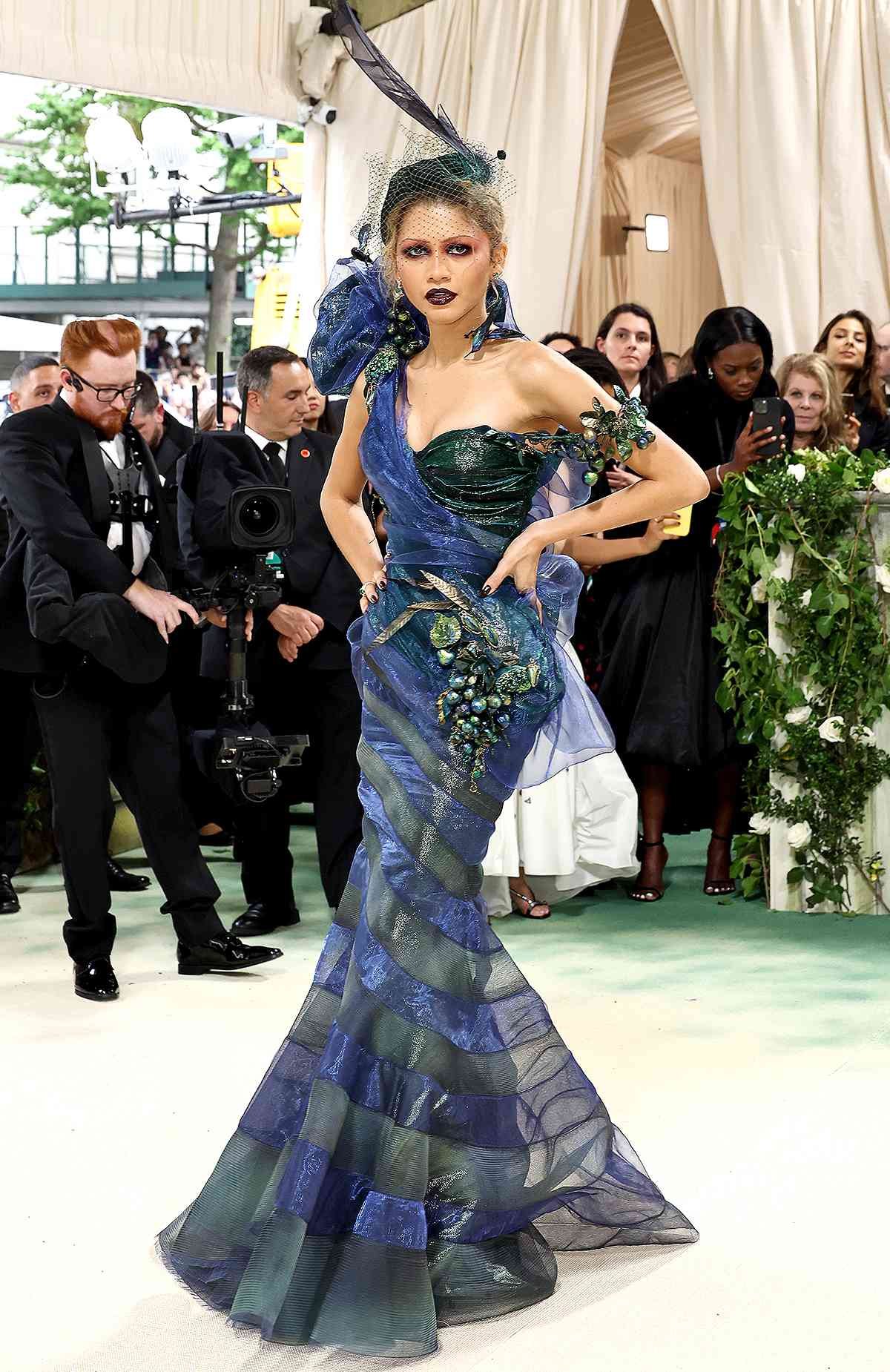
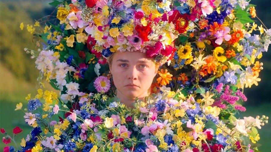
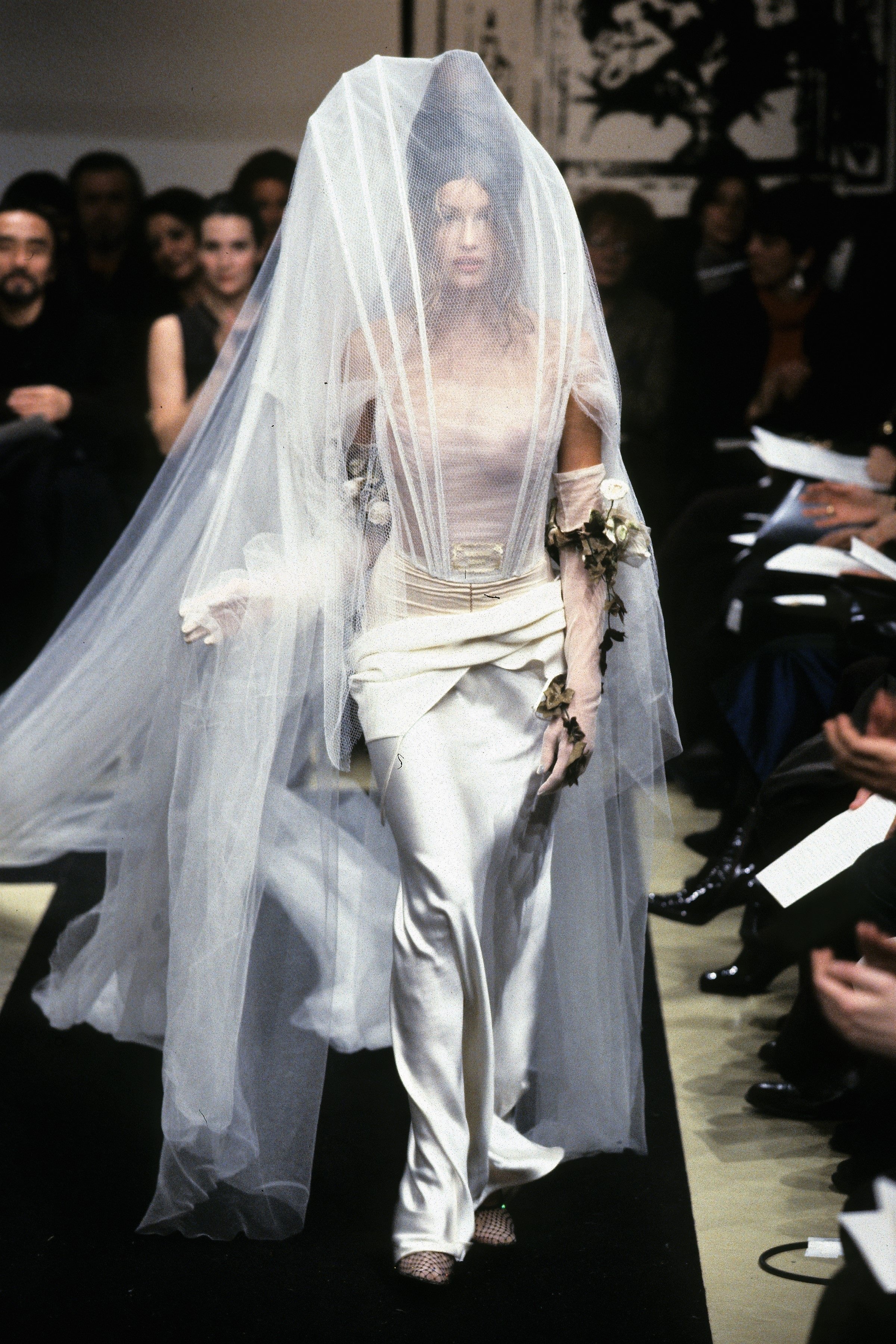
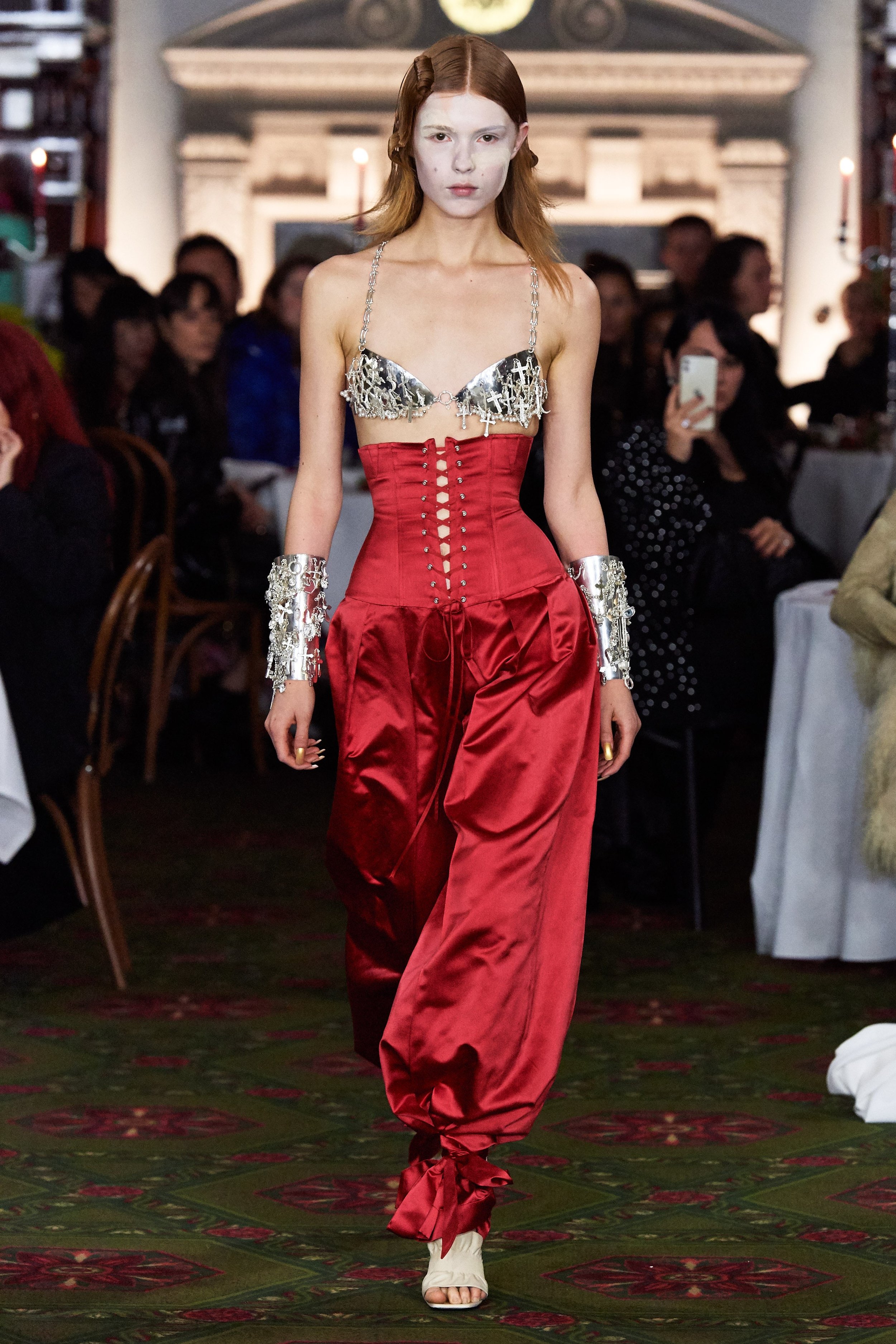
Gorgeous! Lady of the Night! I would have loved to see her in red hair for these looks to compliment the makeup and floral arrangement, but it was a gorgeous display.

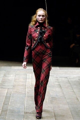
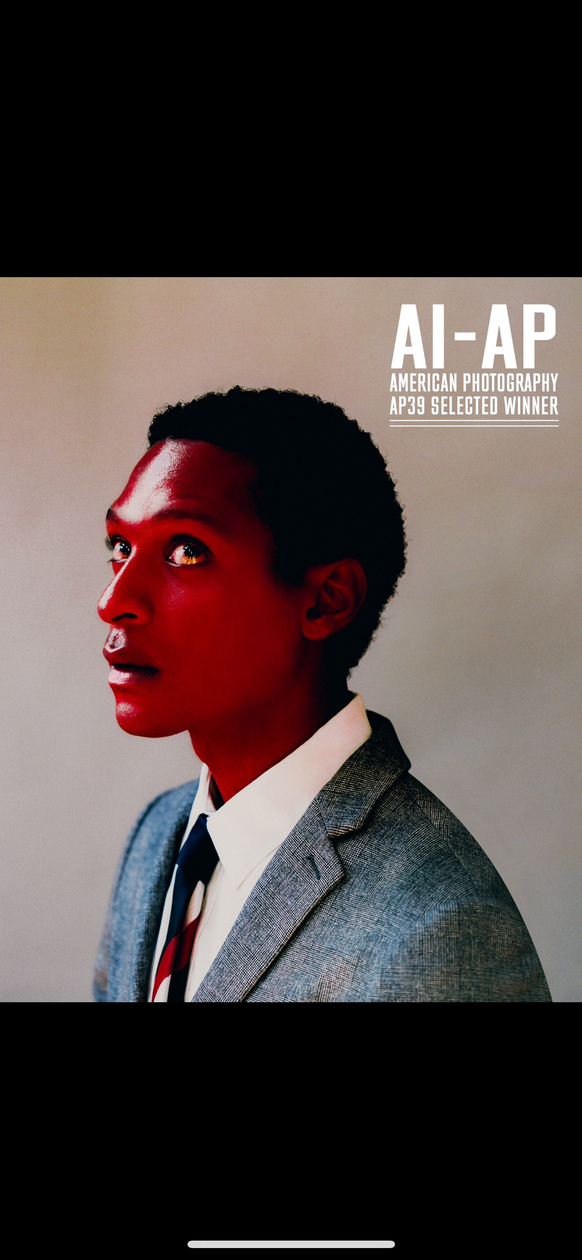
HATE THE ALL BLACK! This is my comment for a lot of the menswear. Play around! Met is not meant for safety. Take it there! Wish it was an emerald green.

All black with a twist! A sexy matador! EL TORRO! ME ENCANTA MUCHO!
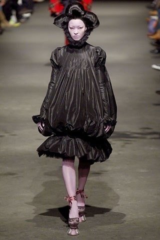
Perfect balance of campiness and chic. I love the Queen of Hearts makeup on her lips! Beautiful touch with the ballooning of the gown.
For me, the glam and wardrobe are going in two different directions. Hair seems too black. Hate the gloves. Maybe a light brown hair and a light green gown would look better.

GUYS! WHY SO MUCH BLACK?!

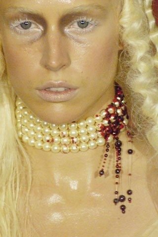
Beautiful woman but the handbag is the only interesting thing about the look. The glam and hair doesn’t agree, and I hate to see Camilla in the yellow-ish blonde. To me, it washes her out.

That’s what I’m talking about! TENS!
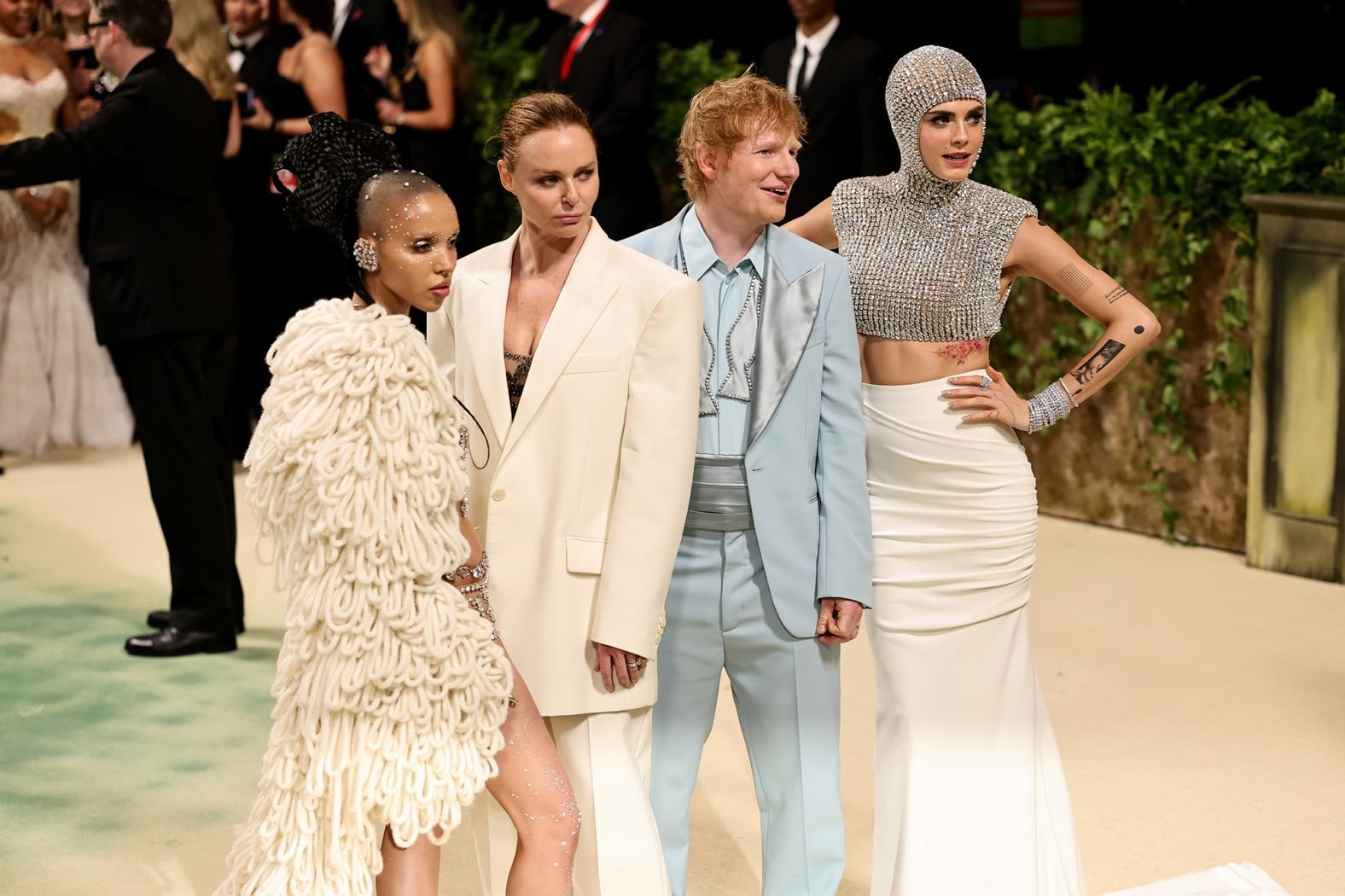
I love a group shot where the designer understood the theme and incorporated several looks on theme. Well done Stella!

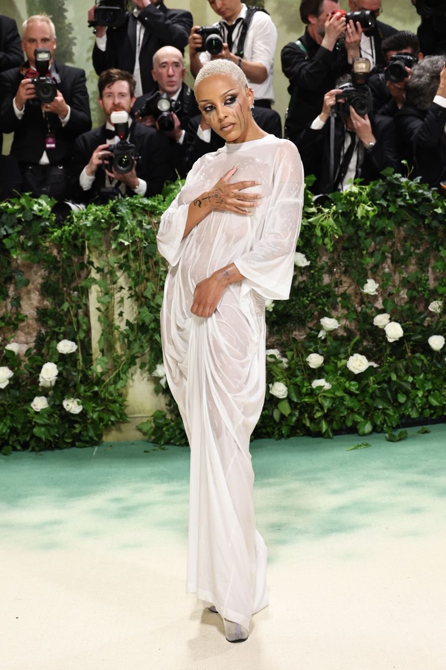
Solid look. I love the hair against the white gown. Good!
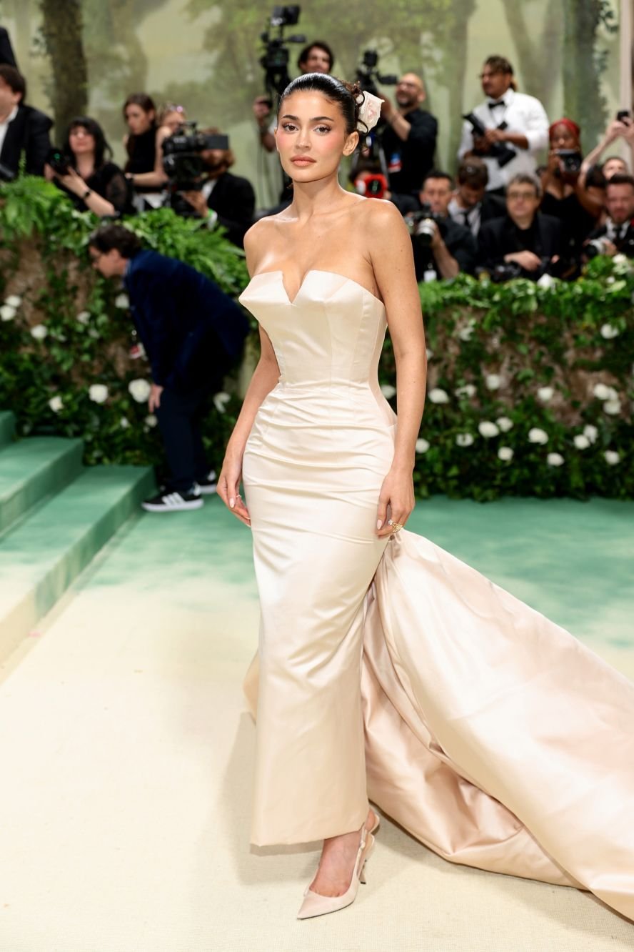
Exquisite gathering around the torso. I would’ve loved a different color heel though. Maybe a custom rose stem heel by shoe designer Kobi Levi?

That’s what I’m talking about! Gorgeous! 10’s!
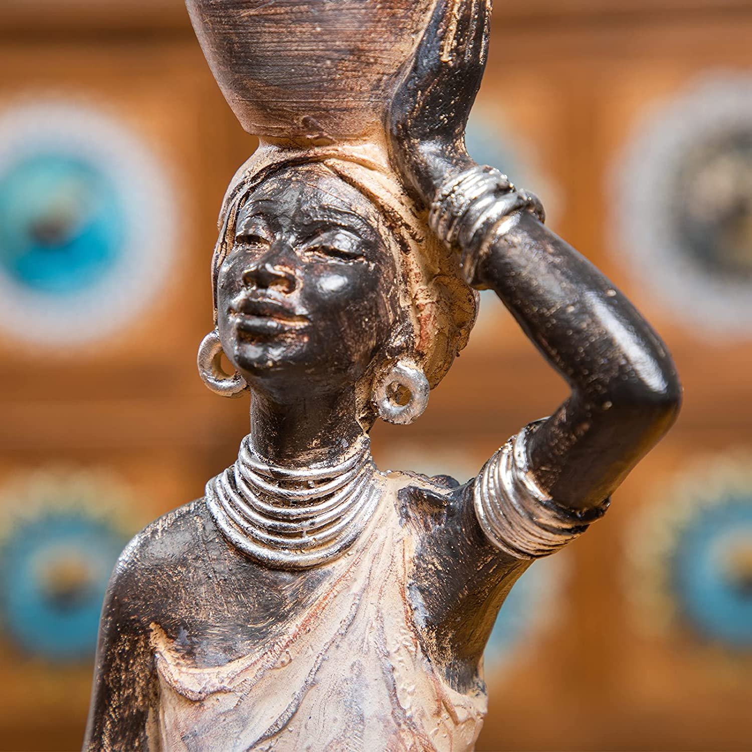
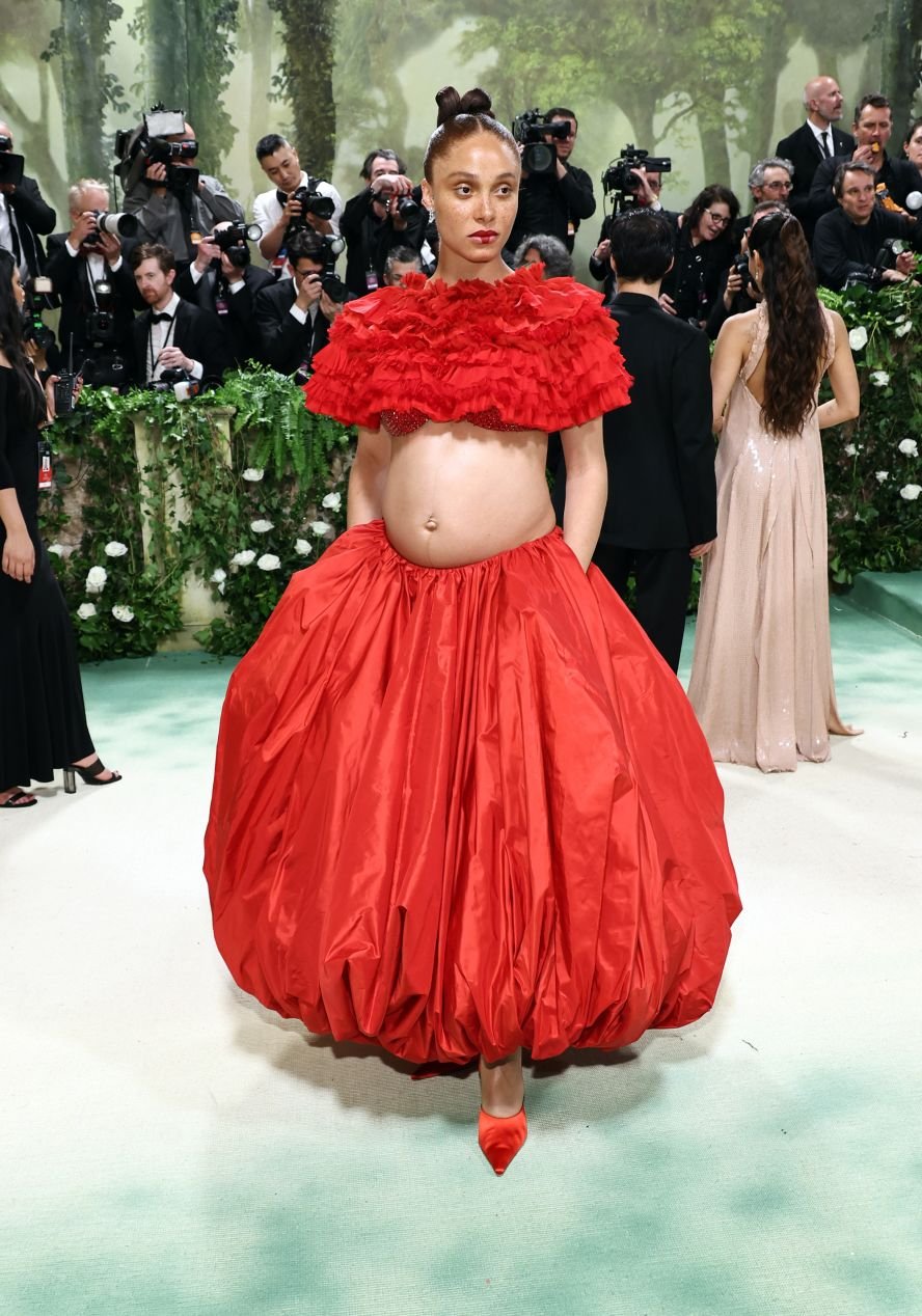
Doja’s look fell short for me because it was not properly done. To give the impression of a sculpture, I would have loved to see face/body paint to create the character. It just seems like a wet t-shirt rather than a sculpture. I also would have LOVED if she came as an African sculpture to represent her South African roots.

I love it. The tailoring. The cream color. Prince Charming but Queer! Obsessed.

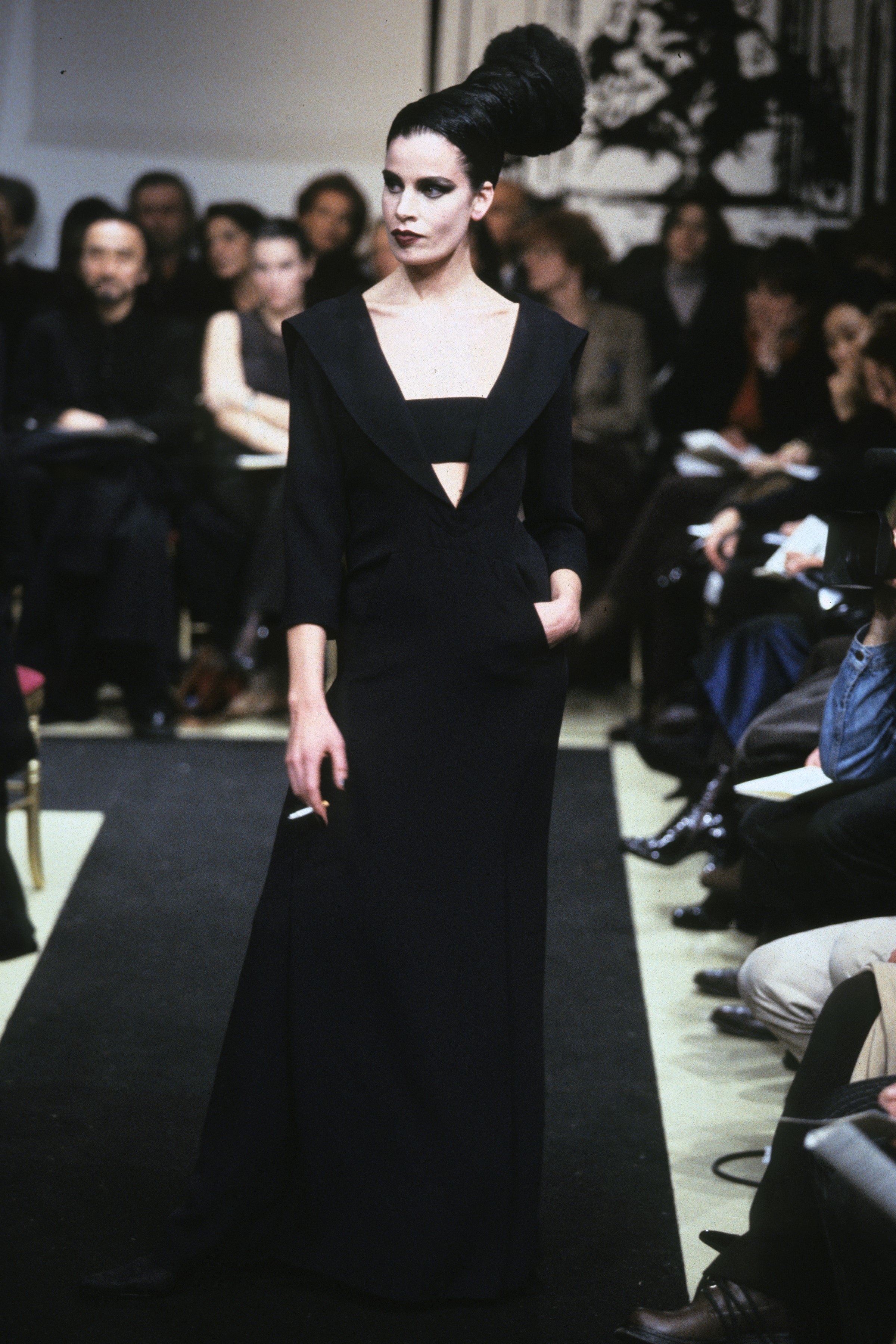
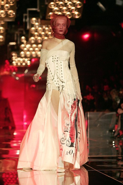
The story according to Kim is, “Speaking to Vogue, Kim explained the inspiration behind the outfit was 'the wildest night of my life in a garden and I just ran out and grabbed my boyfriend’s sweater and threw it on and had to get to work. And my hair is all messed up'.” For me, it feels thrown together. It pays homage to Margiela, so it is an example of archival pulling from a “sleeping beauty” of fashion. However, I hate icy blonde on Kim because it clashes with her undertones. The corset is cool and calls back to the custom Mugler dripping water dress, but this dress falls short because of the lack of inventiveness.

IN LOVE!

PERFECT FASHION MARRIAGE. WOODSY MCQUEENS MEETS WITCHY POOH LANA! MATCH MADE IN HEAVEN!

Gorgeous! I wish they did voluminous curls on Ariana instead of her ponytail. Also, I wish they did Ari’s eye makeup more exaggerated. I wanted her to give Alice in Wonderland. Gamine body types are so cool because you can play with it in interesting ways.

Beautiful. Its giving brand endorsement. Not really following theme in creative ways, but they’re gorgeous.

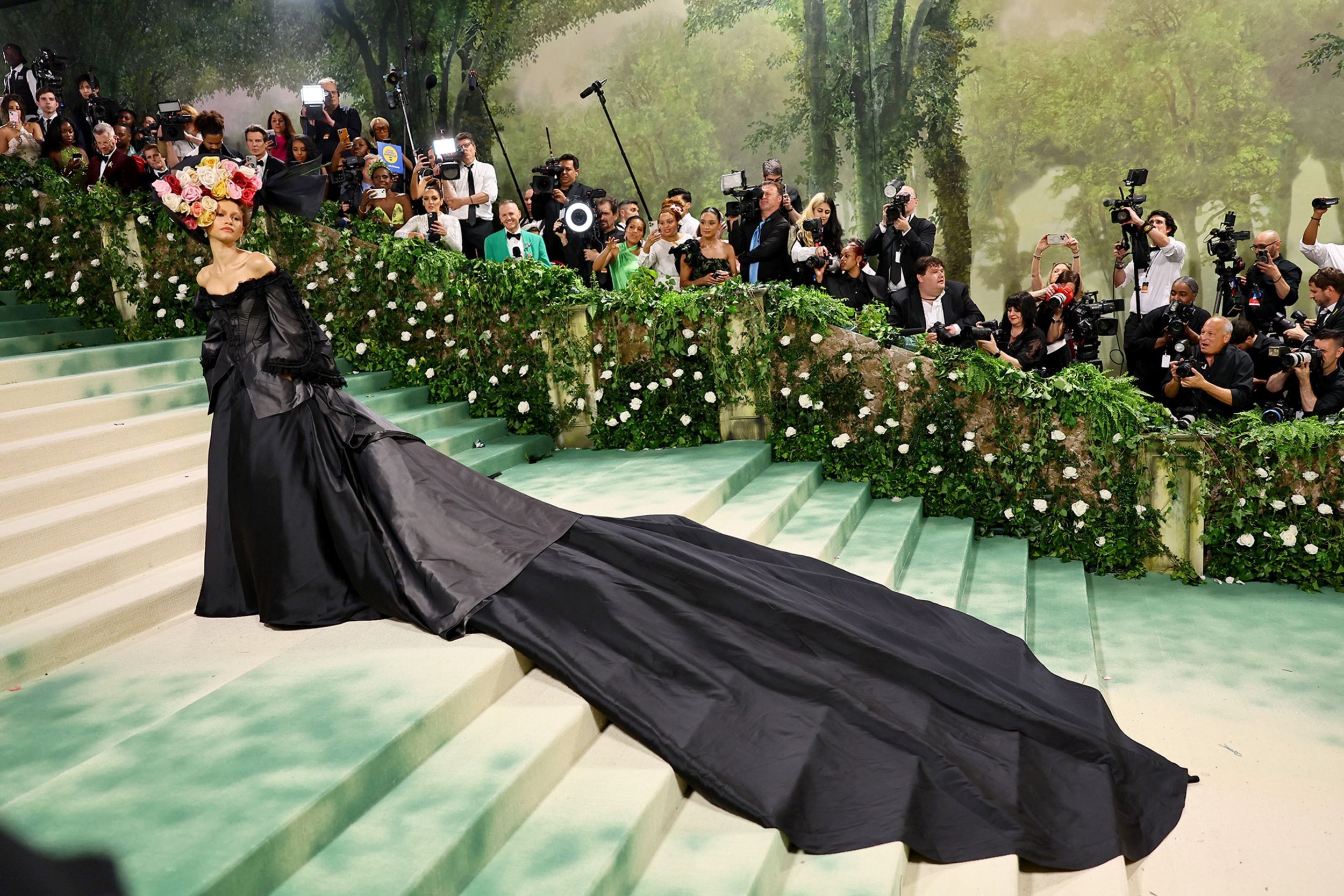
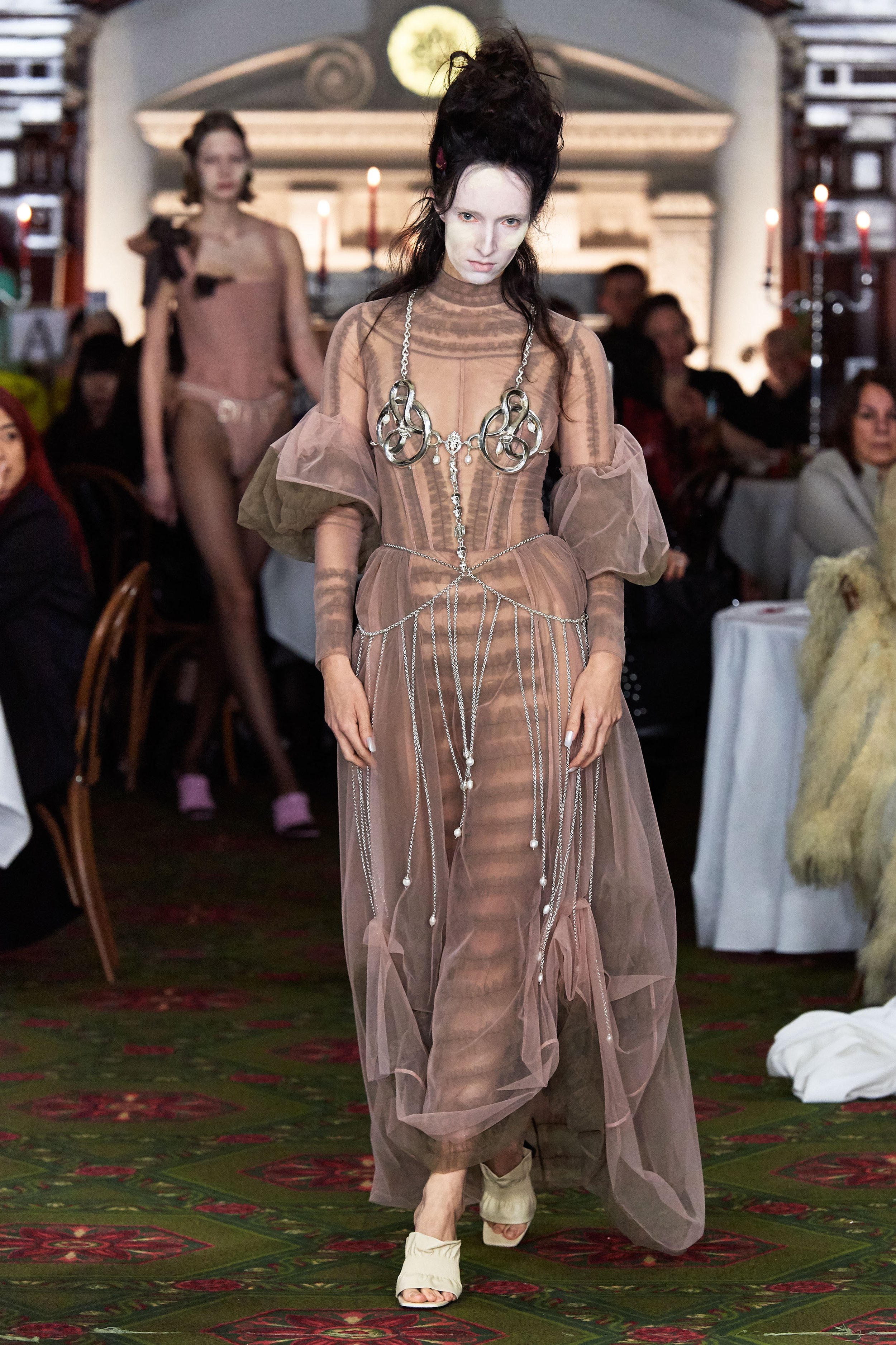
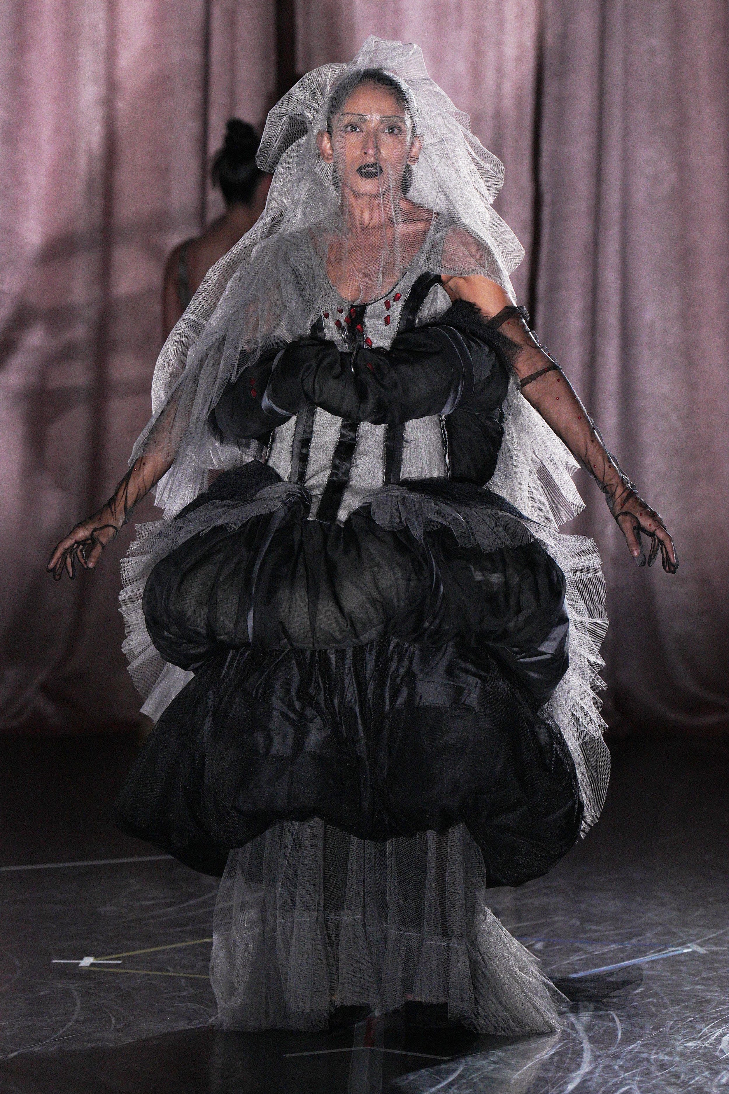
I can see the storyline of her being a witch. I hate to see her in all black, but the train is gorgeous. I wish the hat had a color outline of red. The look needs an accent color. I LOVE the inventiveness though. An idea!

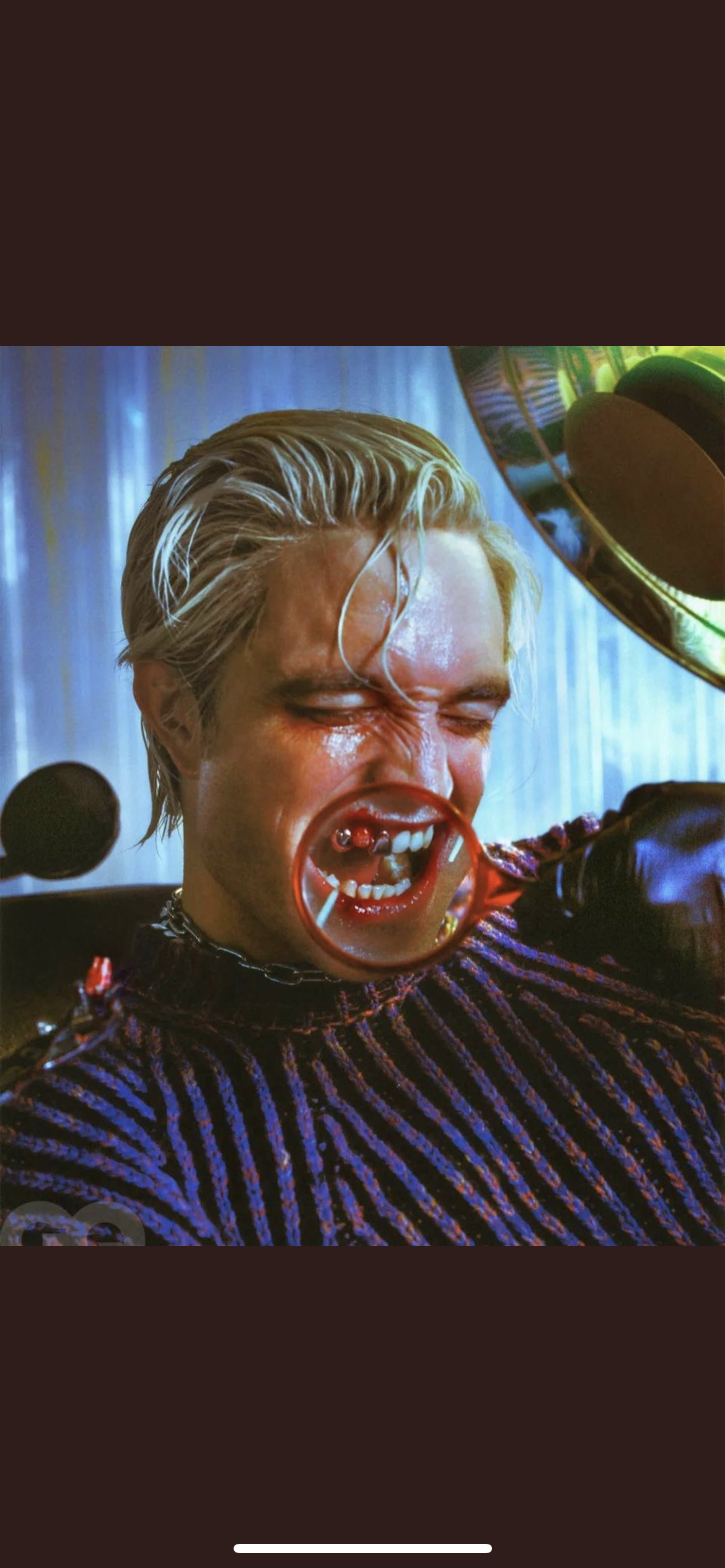
Hate the hair and makeup. McQueen was not a happy or sun kissed person/designer. He found beauty in the ugly and grotesque. I wish she would have taken it there with some cool face/body makeup. Maybe a decomposed makeup look. Way too safe but attempting to be daring. You must FULLY COMMIT!

I love the Himiko cut on her hair. The braid I can live without. Beautiful colorway and the florals are interesting for sure. I would have loved something with more UUMPH! This feels safe even for Nicki because I have seen her in so many outlandish outfits. Love her down though! “How would you like her to be styled then SMART ASS?”. Well thank you for asking!
Keep the himiko in front, but lose the braid, Geisha face makeup and any of these archived McQueen pieces and you got yourself an ICONIC NICKI MET LOOK! You’re welcome.

Why they do the Queen like this? I hate the material. Not flattering to high pixel cameras.

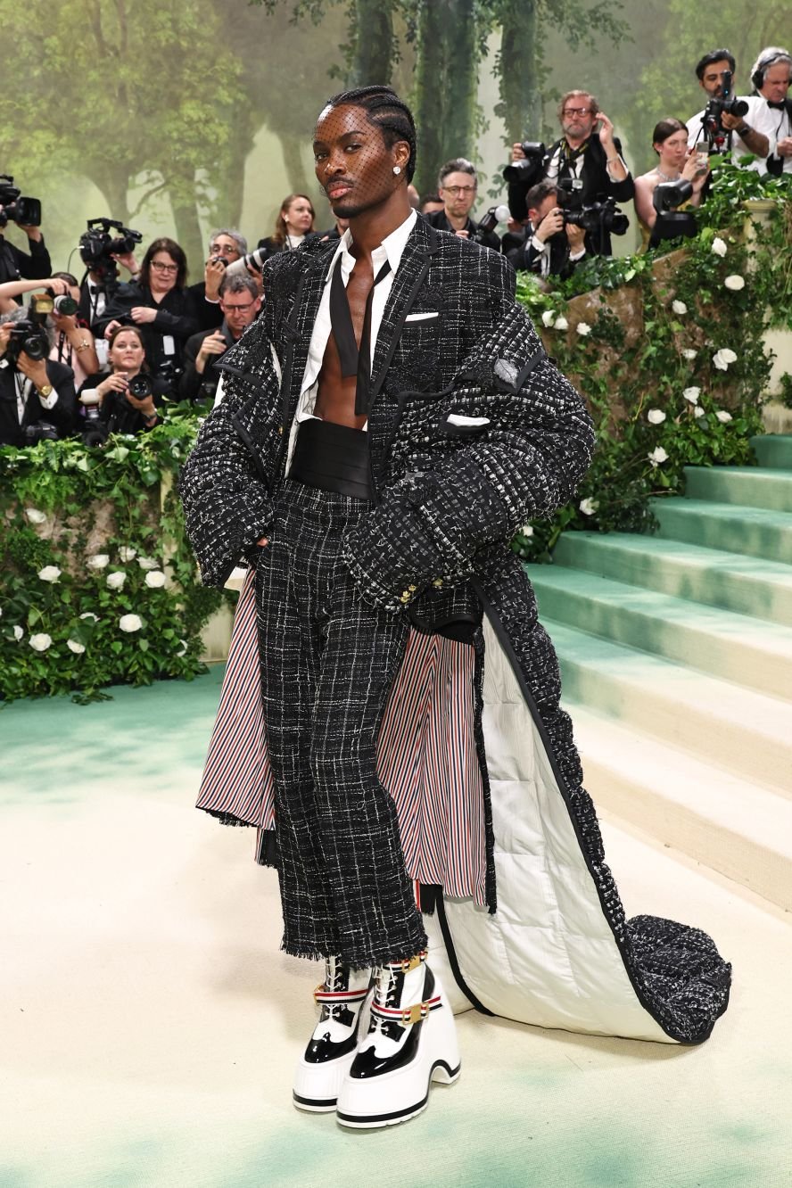
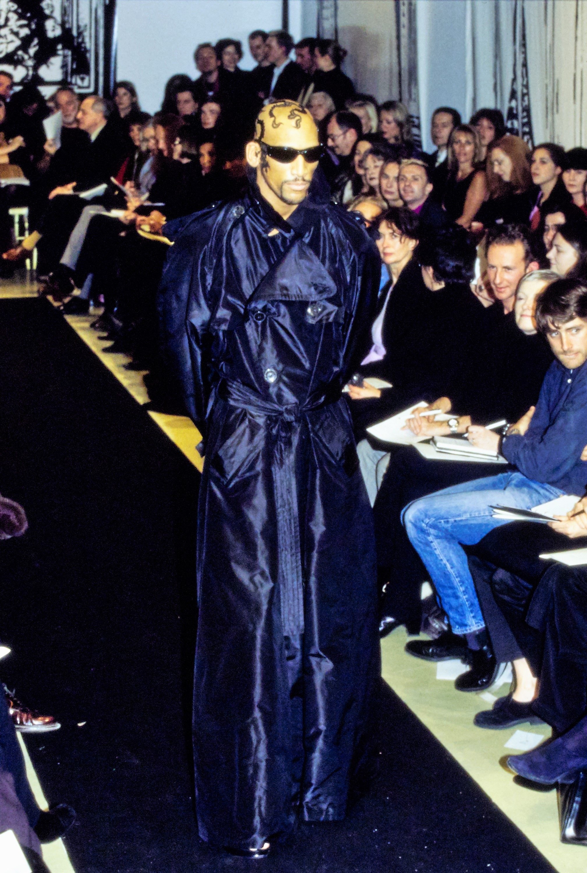
One of the most, if not the most, interesting menswear piece tonight. I absolutely love the almost chocolate brown tint to his outerwear. So subtle but makes such a difference.
Gorgeous. Cinderelli dressed in yelley. It reminds me of when Cinderella made her gown for the ball and her evil stepsisters ripped it to shreds. Or she ran through a rose bush, and it ripped her dress?

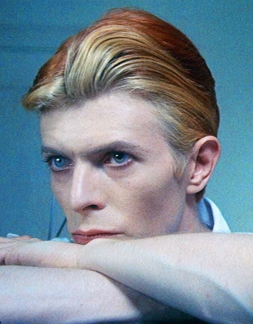
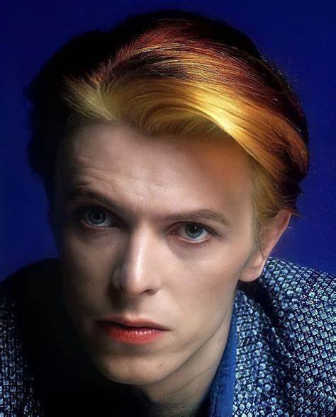
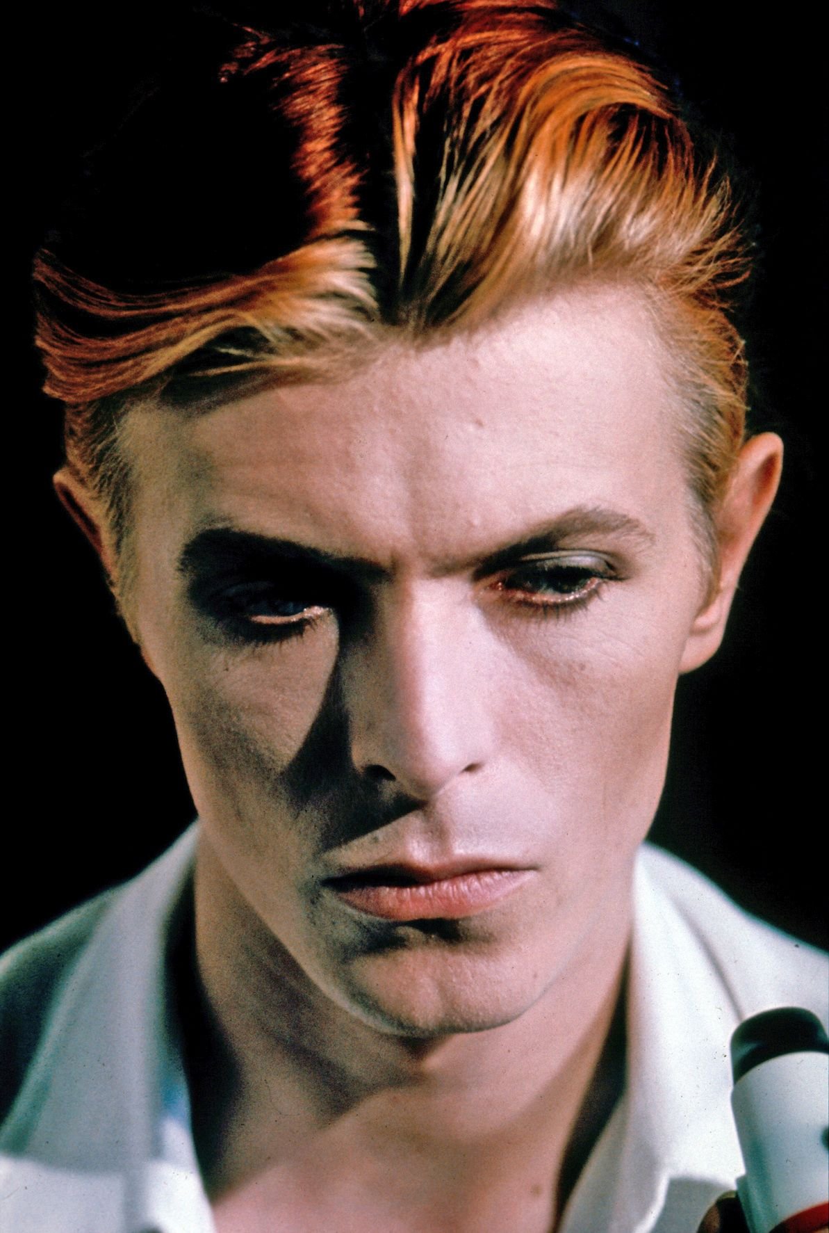
I love the incorporation of tulle and patterns on both their garments. They look so whimsy. I wish they would have played up their hair and makeup. A David Bowie orange hair moment would have been so cool to see on Eddie for this look.
Gorgeous. Babyboy said, “FUCK THE THEME, I GOT A BRAND ENDORSEMENT DEAL!”. The creativity diminishes, but he looks hot. Meeting adjourned.

CLEARED! NO FURTHER THOUGHTS!

She will always be our Princess Aurora.

Gorgeous display!

LOVE IT!

SCORCHED IT! WISDOM TOOK THE BEST MENSWEAR!

DEMI TOOK IT! HARRIS REED ATE DOWN!

The blonde is a statement for sure, but I wish he would’ve gone brown. The suit could have been tailored way better! Another black. So boring.

Gorgeous! The ombre hair adds to the overall etherealness of the look.

LOEWE STRIKES AGAIN! TAY TAY CLEARED YET AGAIN! I would’ve loved some wooden bracelets on her or even a blooming tree in her hair.
LOEWE took it with Greta as well! Beautiful piece!

I would have loved if the hair was a wet pulled back with more sand-like embellishments cascading against her face. Beautiful. The hourglass bag is my favorite part.

PERFECT! CARRIE BRADSHAW EVERYONE!

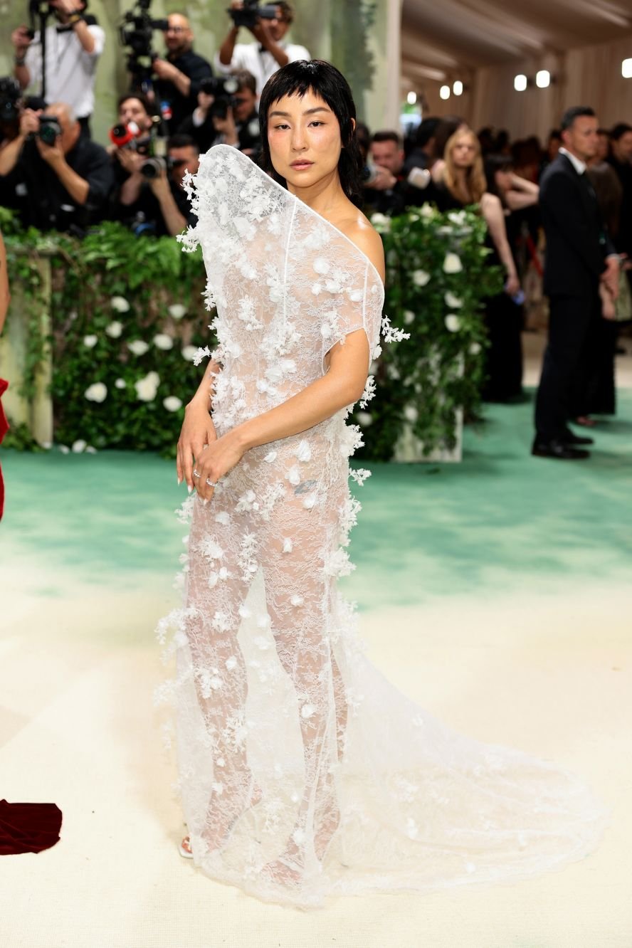
Gorgeous piece by Gauruv Gupta. An abstract piece that perfectly embodies the shapelessness and amorphous elements of nature.

In love. All he needs is a custom Phillip Treacy hat.

YOU ARE THE KING OF ASGARD?! HOW! HOW DID YOU MISS THIS OPPORTUNITY!
So, as you can see, I felt so much frustration watching the carpet. I thought I would be served like a waitress, but it had ebbs and flows. Maybe that’s what fashion is… peaks and valleys. Now, we have seen a majority of the looks from the current Met Gala. What theme would you like to see for next year? I have thoughts
MET GALA ‘25: MURDER ON THE DANCEFLOOR - A DIALOGUE OF HORROR AND FASHION
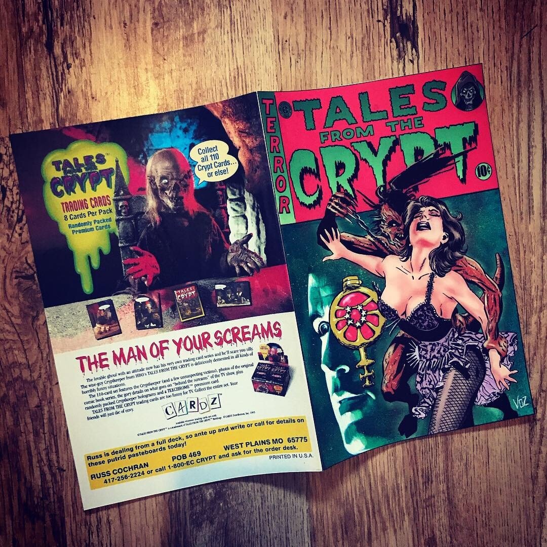
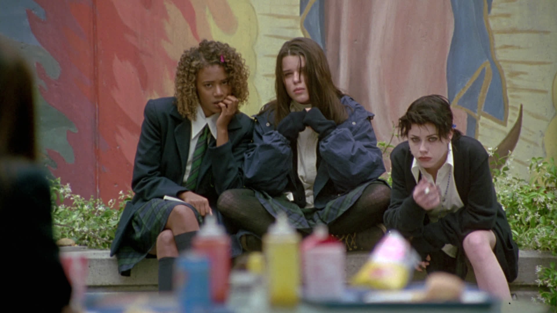


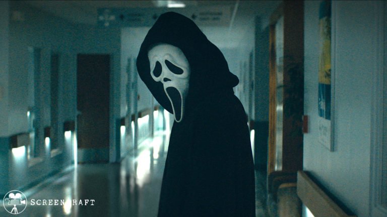

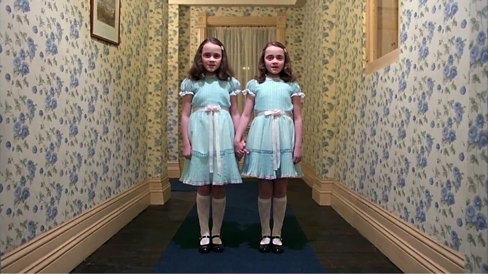

CREATIVITY RIGHT! A tweet last night inspired my motors to get going and I would love to see creativity explored with the theme.
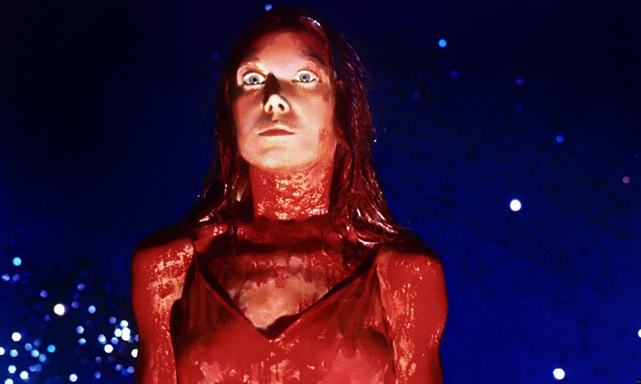
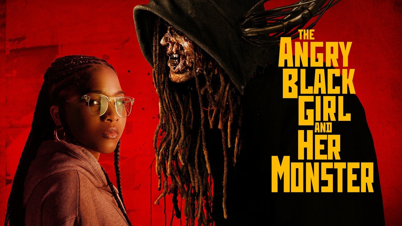
I will include looks that can be a bit devilish, gory, scandalous, provocative and brutal. Anna, you’re welcome!

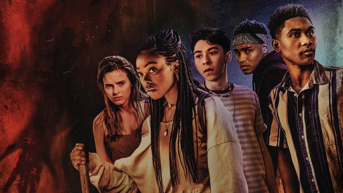
I would love to see the Met incorporate a Horror theme. Sometimes art does not have to be pleasant or pretty. Sometimes art can be vicious.
All in all, thank you for reading and engaging with the post. I hope you enjoyed it! Much love!